A really quick post about how we as security and engineering communicate. The language we use in communicating security issues has been spoken about often and we have gotten a lot better at making the language more inclusive and accessible. We still have a long way to go, but a shift away from confrontational language (we aren’t fighting a war) has, in my experience lead to better acceptance of what we are trying to say. I’ve previously spoken about how changing the way we talk about security issues and adopting the language/terms used by engineering leads to better threat models. What wasn’t covered in that post, and what I haven’t seen covered elsewhere, is the concept of accessibility.
Accessibility
Accessibility refers to making content accessible to all audiences, taking into account possible barriers to consumption, including language, style, appearance, semantic meaning and disability. The web is slowly moving to adopting this more accessible approach using the Web Content Accessibility Guidelines (WCAG) guidelines, how can we use these same guidelines to produce better security content?
In my previous gig we spent some time working with the accessibility guild to identify ways that our security reports and threat models could be made more accessible. Personally I felt that this exercise helped us produce better and clearer content that wasn’t just more accessible but was also easier to understand. By thinking about accessibility, we were able to simplify content and remove superfluous information that was clouding the message. So what was successful?
Language
This is one we’ve already started addressing, without even directly thinking about accessibility. The WCAG guidelines recommend using plain language and avoiding figures of speech and colloquialisms. This is particularly relevant to us in security, avoid using obscure security terms and use plain language to explain the problem.
Colour
We often try and use colour to convey a message in our security reports. How often have you stopped to think about the meaning behind the colour you are using? Are the colours you use accessible to everyone? What does that even mean?
Colour has meaning, not just in a specific domain, but also across cultures and communities. Maybe for you red means danger/bad/risk and green means good/safe, what if it means the opposite to someone reading your report? Have you included enough information in the report or diagram to convey the same meaning but without colour? How impactful would your report be if it was printed out in greyscale?
As a concrete example, while reviewing our threat models we found that different people (me included) tended to use different colours in data flow diagrams. These colours didn’t always have meaning attached to them, other than showing that two distinct systems are interacting with each other (coloured trust boundaries). When someone viewed these data flow diagrams, they often got caught out thinking a specific system was high risk or unsafe because it had a trust boundary in a different colour. Removing colour from the diagrams immediately helped improve accessibility and removed any ambiguity. Not relying on colour made it possible for anyone to get meaning from the diagram, regardless of possible culture bias or the inability to distinguish between two colours (red/green colour vision deficiency). Removing colour also forced us into thinking more about the content in the diagram, and simplifying the diagram down to the strictly necessary bits to convey a message.
If using colour, stick to neutral colours and avoid applying meaning to the colours themselves. A quick test is to remove all colour from your diagram and see if it still “says” the same thing.
Contrast
Colour goes hand in hand with contrast. Thinking about adding some colour? Think about contrast first. Any colours used should be checked using a contrast checker such as https://webaim.org/resources/contrastchecker/. You are looking for a contrast ratio above 4.5:1 (at a minimum), but aim higher, getting as close to a AAA rating as possible. This ensures your diagrams and content are accessible to everyone, regardless of the medium it is viewed on (your customer might not be using the latest 34" Ultra HD screen like you have). I wish I’d known this when doing screenshots earlier in my career. That red outline around the content I was trying to bring attention to? Yeah, not the best choice in 90% of situations.
Text
Text is what we use the most in conveying our message, how we represent the words we use is equally as important as the actual content. A lot of time it might be out of our control what font and font size is being used, such as in a web form used for bug bounty reports. However, in diagrams or self generated reports, we have full control of the text. Here again, simple is better. Use a simple font and aim for a larger font size. Maybe I’m getting old, but I now aim for 12pt in all my diagrams, where before I’d be happy to use 9pt. Rather force zooming out of a diagram, than forcing zooming in. Screenshots of your terminal? First up the font-size (and don’t forget about sorting out your terminal contrast too), then screenshot it. The easier your diagram/screenshot is to read at first glance, the better it is going to be received. First impressions count in communication, making your content easy to consume at first view makes it seem a lot less hostile. Keep in mind that lots of security-engineering still falls down because a perceived hostility (going both ways).
Lines
Line what? Yup, the lines used in diagrams, they matter. This applies to connectors, the borders on shapes etc. Avoid thin lines, just like good contrast and a strong font, thicker and bolder lines lead to easier to read diagrams. Typical diagramming tools give you shapes and lines with 2pt, up that to 4pt. This, just like font-size, might mean forcing zooming out of diagrams, but ensures detail is not lost. In diagrams showing flow, avoid connectors with square/90-degree angles, instead use curved lines which are easier to follow. The eye naturally follows curves better than right-angles. Connectors should never cross each other, you want to ensure a clear uninterrupted flow from one component to the next. Use spacing to avoid crossed lines.
Spacing
This one is easy and you are forced into this by following the “large text, thick lines” guidance above. Use space between components, don’t try and squash everything into a small area. Again, allow for zooming out, rather than zooming in! Space between components helps the eye follow flow better and the lack of clutter makes content easier to understand/consume.
Logos/Images
Specific to diagrams; try to avoid inserting logos and other images into diagrams. Keep the diagrams simple and let the content speak for itself. Don’t rely on your audience knowing that the cloud image is supposed to represent AWS, make it clear in text. Once you start adding logos, you quickly move towards over use and produce cluttered images. Again, keep it simple.
Example
A slightly contrived example and a really simple data flow that probably doesn’t demonstrate this to its fullest. It might also be more impactful opening the two images in new tabs.
Here we have a data flow using default line widths, text sizes, logos and colour. Giving this to someone requires them to parse numerous bits of information, what does the red line for “Internet” signify? Why is the box orange? What does the logo in the Lambda process signify and in the S3 bucket? Does this diagram hold up well on a small display? Large display? Although not complicated, the amount of additional information to parse is significant, when we simply want to demonstrate how an image upload request flows from the browser, through Lambda and into S3.
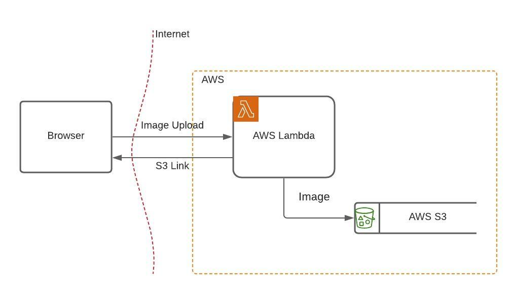
Data flow diagram, with a few extras
Compared to the diagram that uses 4pt lines, no colour, no logos, 12pt text and is more generously spaced. It conveys the exact same data flow, but give these two diagrams to users, the second is way faster to parse and understand. There are no lingering questions about additional meaning and the content will (hopefully!) mean the same to two distinct consumers.
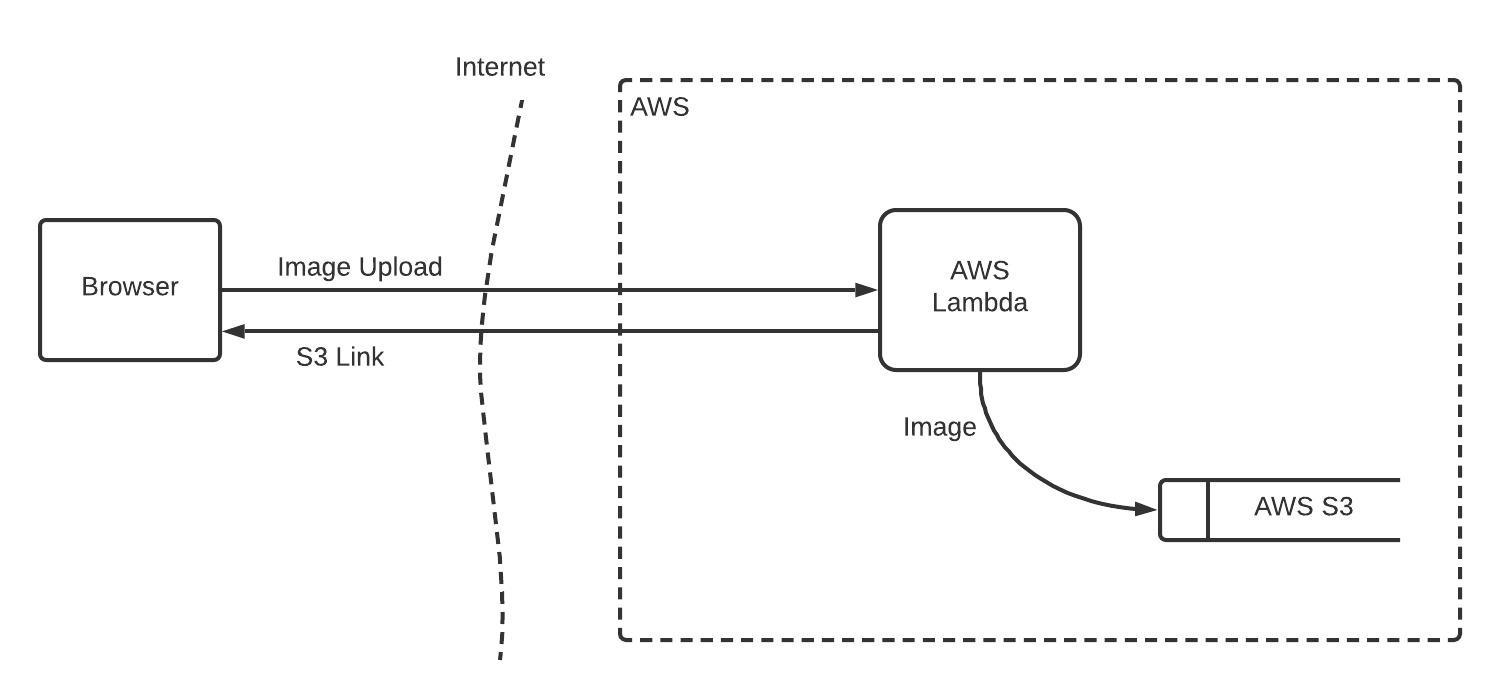
Simplified diagram, focusing on content
Conclusion
I’m still learning about accessibility and trying my best to apply the principles where every possible. It really feels like my work has become more accessible and understandable thanks to these small changes. Have a look through the a11y checklist https://www.a11yproject.com/checklist/ and see how you can improve your own content. The project is web content focused, but the concepts are easy enough to adjust to areas such as pentest reports or diagrams.